conclusions: the future of the interactive museum experience

In conclusion, I found the Art of the Americas wing at the Museum of Fine Arts in Boston, to be an excellent case study for the purpose of applying a large array of the topics covered in Information Systems for the Visual Arts. I found that the wing, in all its manifestations – from online to on site –  epitomizes what an arts institution can do with the tools that are now available, in order to make viewing art an educational and accessible experience to a wide audience.

On site, the museum incorporates elements that follow the current trends in museums, by using technology and transparency to engage audiences. The museum planners had the foresight (not to mention, a serious amount of capital) to understand this trend before it was full-blown, allowing them to create behind-the-scenes videos as they made progress on the wing. These peeks into the inner workings of museum practice are actually what I personally found the most interesting. By creating material about the entire process of displaying art – from conservation to installation – acquaints viewers outside the art world with the museum and the art in a new sort of way. By making the procedures of museum happenings more relatable and more interesting, the MFA has created the potential to make more museum fans. The fact that these videos are accessible in a variety of places – from installations at the museum to YouTube, ensures that the museum is creating accessible experiences for a wide range of people.

The MFA also has successfully incorporated fun, educational interactive touchscreens into the exhibits in the new wing. Using technology to access information is what younger generations have come to expect from learning experiences, and the museum does a great job of accounting for this. At the same time, the touchscreen stations always play second fiddle to the artworks, which I find to be essential. The MFA does a great job of making sure that the technology is only a supplement to the art experience and not the whole experience. I think the struggle to make sure that there is not a disconnect between technologically relayed information (whether a touchscreen, iPhone app, etc) and the artwork it references is going to be one of the major struggles that museums will be dealing with in the future.

The MFA continues its outreach to a wider audience with its website and social networks. I think it handles both aspects in an extremely successful manner. Its goal with its website redesign was to overhaul its image and create a dialogue with past and future visitors, and I think they certainly achieve this. Their “Buzz” page highlights viewer-created content and allows for visitors to engage with the museum on a sort of peer-to-peer level. The museum has definitely allowed for their online presence to become a platform for conversation, rather than a podium from which to speak down to people.

The MFA’s approach to the artworks they’ve installed in the wing furthers this inclusive atmosphere. By incorporating artworks from the entire American hemisphere under one umbrella, they’ve made giant leaps in revising a very established canon. This revisionary thinking hopefully will create a dialogue not just amongst museum visitors, but also among the academic art community. I really appreciated that the museum has placed all American cultures on a level playing field, and I hope other institutions take note.

Since the new wing just opened on November 20th, it’s too soon to tell what the ripple effect – both on the museum’s audience and on the museum world as a whole. From what I have read in articles and seen in comments on the MFA’s social pages, the wing has been incredibly well-received so far. In fact, with perfect conclusive timing, the MFA actually emailed me a visitor survey this very morning, asking me to complete it with my feelings about by visit to the museum and its new wing. The museum seems willing to listen to the audience that it is trying so hard to cultivate and engage. Here’s to hoping that they are ready, and also willing, to be flexible and adapt to the ever-shifting wants and needs of that very audience.

screenshot of the mfa visitor survey, emailed december 17, 2010


Posted in Uncategorized | Tagged , , | Leave a comment

and let’s not forget the art: reviews of the art of the america’s wing

ralph coburn's "blue, white, green," third floor, modern gallery

During my experiences in all my courses over the past semester, I’ve realized that spending so much time analyzing exhibitions and thinking about all the elements that go into making a successful show, as well as analyzing arts institutions’ practices on a broader level, makes it rather easy to get caught up in breaking things down, forgetting why you are doing it. Which for me, is, of course, the art. So, in my analysis of the new wing and the ways in which the MFA has activated the museum’s physical and online space to engage audiences, I wanted to make sure I spent some time talking about the art.

The main aspect that is important to touch on, in my opinion, is the fact that the MFA has chosen to widen the canon of what is included in displays of “American” art. The installation has expanded the term to entire art of all the Americas – Canada, the United States, and Central and South America. This is innovative in itself. Most museums keep their Pre-Colombian and Native American collections quite separate from their “American art,” by which they simply mean art from the United states, from the colonial period onward. This is a huge step in terms of how institutions regard exhibiting cultures, and I really felt very positively about the incorporation of all these types of artwork with a tone of equality. The reinstallation has also attempted to widen the canon in regards to incorporating more artworks from minorities, right alongside more well-known figures. As quoted in an article in the Christian Science Monitor, Director Malcolm Rogers states the goal was to, “try to tell a variety of American stories, acquiring and showing more art from Central and South America, early Spanish America, and work by women and artists of color.” The review of the wing in The New York Times finds that this is the key success of the exhibition is this integration of normally separated artworks, stating: “If any museum could pull off such a summit meeting, this one could. And under the leadership of Elliot Bostwick Davis, chairman of its Art of the Americas department, it has.”

A review in The Los Angeles Times finds the incorporation quite succesful. The review states: “Nothing is more surprising than the ground floor, which kicks off the wing’s chronology with an unexpectedly absorbing display of pre-Columbian objects from Mesoamerica. Who knew MFA had such rich holdings — especially great Mayan painted vessels, as fine as anything in the building?” This sentiment was reflected by many other reviews, as well as my own personal impressions. Not normally a fan of Pre-Colombian art, I found this to be the most interesting and visually compelling examples of an installation of these types of artworks.

All the reviews I read applauded these canonical revisions. Where critics seem to find issue was in the modern art galleries and the collections displayed in them. The LA Times went so far as to call it a fiasco. The article points out that this is often the problem with a revisionary approach to art history – when a museum revises upon the traditional art historical approach, they have to struggle with the fact that the items in their collection reflect the old approach, and therefore there are lots of gaps.

A review in The Boston Phoenix had issues with the artwork in the modern installation, noting that the whole exhibition sort of “trails off.” The article also critiques all the areas it finds missing, including the civil-rights movement, feminist works, and social criticism. But, as pointed out in several other articles I read, that now that the museum has space for displaying works, the museum hopes that collectors will fill in the gaps. The New York Times has a much more positive attitude towards this part of the collection, calling it a “correctable flaw…[and] a collection in progress.”

In the article in The Boston Phoenix, Director Malcolm Rogers confidently addresses these missing elements: “Our collections could be strengthened. But it is a statement that we’re looking much wider afield at the cultural, the ethnic strands that make up the continent, to give a more complex picture.”

While the modern floor of the wing, is generally acknowledged as the weak link of the installation, most reviews found that the positive aspects far outshone this small weakness. The Times finds that the point truly is the revisionary nature of the display – that the museum has chosen to put their “institutional weight” behind the decisions to widen the definition of “American” art. While people might take issue with this expanded canon, the Times finds that  the “art itself comes to the rescue. So much about the new Americas Wing is so startling, stimulating and beautiful that you just want to lay down your arms.”

I agree that the modern wing is not that strong, but coming from looking at the collections of so many New York institutions, this is often the feeling I get at institutions in other cities. But, I agree with the reviews I read that the inclusive nature of the installation outshines any missing pieces in the encyclopedic approach to art. By creating a space that includes a wider view of American identity, the museum has taken the first step. Hopefully collectors and future donations will allow the museum to fully flesh out what it has started, and create a truly impressive, comprehensive view of the history of all of the Americas.


Posted in Uncategorized | Tagged , , , | Leave a comment

creating an interactive museum experience: uses of technology in the art of the america’s wing


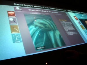
educational touchscreen about the practice of conservation, located in "behind the scenes" gallery on 2nd floor


The analysis has now come full-circle, back again to the actual experience of the Art of the America’s wing at the MFA, which is what started me out on this project. The new wing, in addition to housing 5,000 artworks, also incorporates 16 interactive technology stations in 10 different galleries throughout the 4 floors. Not only do these multiple areas allow for interactive, educational exploration of the museum’s artworks, they also employ up-to-the-minute technology and a wide range of features. This post will examine the offerings of the MFA’s technology installations and will include some videos I made on my visit (for which I’ve created a YouTube account – the links within the text take you to the relevant videos).

The first encounter with this technology we had on our visit to the new wing was on the ground floor, in the Pre-Colombian gallery. A technology station was set to the right of the main entrance to the gallery, and provided an in-depth, interactive look into the iconography of Mayan vases. The touchscreen features the ability to select a vase, roll it out to view the entire round design all at once, and to zoom in on elements to get a closer examination. The screen also provides additional information about the meaning of the iconography of the parts of the vase, and provides it for whatever aspect is selected. The tool was so fun to use, I had to remind my boyfriend to stop messing with it so we could go actually look at the real vases in the display case a few feet away. This is, of course, the main issue that comes up with adding technological aspects within museum galleries – people become so consumed with the onscreen images, that they might not take the time to examine the true object. Luckily, the way in which the actual vases were installed were compelling enough to override this urge.

While the Art in the America’s wing has 16 of these high-tech touchscreens, the wing is so large that they are definitely interspersed enough that the art remains the focus. They function more as an exclamation point to the art (or maybe a parenthetical statement?) than as the forefront of the exhibition space.


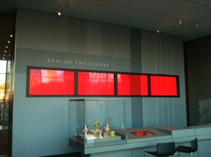
video installation in "behind the scenes" gallery, 1st floor, art of the america's wing


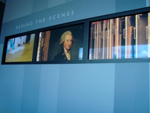
The place that these screens are one of the main stars are in the “Behind the Scenes” galleries on floors 1-3. A large strip of monitors mounted on the wall plays an alternating stream of videos that give the museum visitor a peek into how the wing all came together. As mentioned before, this video series shows everything from the designer at work, to conservators in action, to the installation of artworks. The way we actually found our way into the gallery was from a mention on a label near the enormous Thomas Sully piece, “The Passage of the Delaware.” The label directed us to check out the “Behind the Scenes” gallery to find out how the museum staff managed to install such a large painting. In the gallery, a video of the installation process is incorporated into the video montage on this strip of monitors. Also in this gallery was an installation of a selection of decorative objects, next to a touchscreen with a program that let the visitor create their own plate from a variety of accurate porcelain designs. While not the most fun “game” element, this can be seen as a successful attempt to make decorative art objects more interesting to museum-goers who normally view them as plates in a glass case.

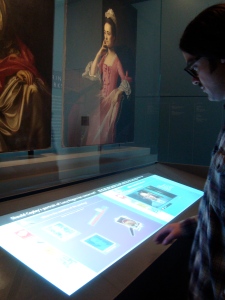
The museum does a great job of using touchscreen features and art objects together to supplement the educational experience. In a side room of one of the “Behind the Scenes” galleries, the museum has installed a display geared towards educating the viewer about conservation. The display features several objects in varying stages of condition, from fixable to beyond the rescue of conservation practices. A touchscreen below the objects (see image at top of this post) allows the viewer to zoom in to problematic areas of the artwork, watch videos of the conservation process, and listen to curators discuss the condition of the objects and the procedure. The successful combination of object and technology really leant to my understanding and created a truly interesting learning opportunity.

In addition to these really great installations in these specific educational galleries, there was one more interactive station that I found particularly innovative and exciting. This installation, was a touchscreen table found in a modern gallery on the 3rd floor of the wing. This large table allowed for multiple, I believe up to 6, people to be playing with its offerings at once. I found the technology capabilities amazing – it was able to sense a variety of touch points simultaneously. The function of the screen was to allow for museum guests t select from one of four templates of artists featured in the room, with which they could add upon, inserting different colors, arrangements, or shapes. For example, visitors could create their own Georgia O’Keeffe nature piece. The best part, I felt, was that the table allowed multiple visitors to engage with the program at once. Not only does this allow more people to experience it, but it also created an environment of conversation of fun between the guests, in addition to between the viewer and the art. I thought taking the moment beyond an individual experience to a community level was a really great, innovative way to create an engaging overall environment in the galleries. My boyfriend and I definitely bonded with the other visitors at the table with us, who, I may add, were all in the 55+ range. It was also fun to see this age group using the technology. Adding to this sense of sharing, the program also allowed the user to save their “masterpiece” in a shared folder, creating a nice sense of connection to the museum and of leaving a mark.

All these additional technological installations really supplemented my experience, and I was particularly impressed with the amazing high-tech quality of all the features. Because I was so amazed by the capabilities of these additions,  I wanted to spend some time looking into these features. From an article about (discussed previously) the technology approaches of the new wing, I discovered that a company called TacTable was responsible for the touchscreen stations. Considering the interactive, high-tech nature of the touchscreens, I was incredibly disappointed by the company’s website, which doesn’t seem to be updated to feature the MFA project, and also gives really no information about the touch tables at all.

Overall, I felt that the technology integrated into the installation of the new wing really added to the experience, creating the opportunity for visitors to connect to the artwork, learn a little more, and have fun while doing it. Throughout, the technology adds to the art, rather than distracting from it, which I find to be absolutely essential. I felt this particularly about the “Behind the Scenes” galleries. The use of multi-media – art in combination with video, images, and text –  created a truly informative experience. In this, the MFA has firmly grasped ahold of the current practice of using transparency and exposing the process, to make the museum environment a more friendly, accessible place.


Posted in Uncategorized | Tagged , , , , | Leave a comment

establishing an online presence: social media networks

"Hiraqla," Frank Stella, 1968. Found 3rd floor, Art of the Americas wing

As with the MFA’s website, I had never seen any examples of the museum’s usages of social media prior to my visit, and therefore cannot draw any sort of pre- and post-wing comparisons. Rather, I will analyze the methods that the institution currently has in place for using its social media tools, examining how exactly they were used to the museum’s advantage regarding the promotion of the new Art of the America’s wing and the creation of the MFA’s new image.

As mentioned before, links to all of the MFA’s social media sites can be found on a single, specific page on the MFA main website. It’s a great approach to organize all these outside features together, so that if people are interested in one type, they still will see all the other sorts of networks that the MFA employs. Also as I have said before, I am sure other museums and institutions will be moving in this direction. From the arts organization websites I have examined, which is quite a lot over the past semester for all my various courses, my perception is that the MFA’s “Buzz” feature is rather unique. Many organizations allow visitors to add photos to their Flickr or retweet any mentions, but this is the first time that I have seen this visitor participation all compiled together and highlighted so heavily on an organization’s website. This obviously is a major component of the “dialogue” aspect that the museum was seeking with its website redesign, a way to get people excited about talking about and engaging with the institution and its art. To me, this feature suggests that the MFA was lucky enough to be implementing an online redesign at precisely the right moment. Museums all seem headed in the direction of seeking to engage their visitors and also at adding certain interactive components that a wider audience has come to expect. The MFA redesign, with the page just with links to their social media sites and the “Buzz” section that highlights visitor participation, fully incorporates the new trends to their advantage.

To begin my analysis of the MFA’s usages of the available social media tools, I want to start with my least favorite, their Flickr page. The MFA’s Flickr page is successful in that it allows visitors to post their own images, tag them as the MFA, making them all available together. There are two aspects that I don’t like – that the museum does not post any of their own images (that I could find) and also, that the majority of the images, more specifically none that are of the Art of the Americas wing, are not Creative Commons and restricted from use (which explains in part why all the images used in this blog are all my own from my visit). I found this rather frustrating, though I am not sure if there is a solution, as the institution cannot control what visitors mark their images as. Perhaps, the MFA can add their own set of pictures that are Creative Commons and available for fair use purposes. This would definitely further the sense of participation and the feeling that the museum wants an equal engagement with viewers.

The museum’s Foursquare page has a decent number of check-ins, but not a lot of comment participation and none made recently or after the opening of the new wing. One way that I have seen arts organizations use Foursquare successfully is by having contests for check-ins that offer prices such as merchandise or free tickets. The MFA might want to consider this approach for activating a stronger level of participation on the page.

The museum goes a long way towards making up for these weaker networks, with their other social media pages. Their YouTube page is a great place for them to post the videos that they produced to correspond to the new wing. They have several categories of videos, including “The New MFA” and “Behind the Scenes.”  The former playlist has a slide show of a step by step view of the construction process of the new wing, videos of gallery installations and a virtual tour of the wing with Director Malcolm Rogers. These elements provide a wealth of information – the virtual tour about what can be seen in the wing, and the videos of installations with a behind the scenes look at how much work went into the display of the artwork in the wing. In combination with the “Buzz” page on the MFA website, that provides link to visitor’s videos as well, the MFA does a great job of providing informative material in an interesting way. The videos can be seen as both educational and also as means of stirring up interest in the wing and to draw visitors.

The museum’s strongest usage of its social media networks are its Facebook and Twitter pages, probably because these two are the types of networks most geared towards conversation and participation and lend themselves most readily to the museum’s goal of creating a dialogue. When I began this project, I started following them on both pages to see what sorts of things they post and how often. Both the Twitter and Facebook page have the same links and comments posted, and are undoubtedly populated at the same time. On the Twitter page, the MFA retweets any mentions, which seems to be standard operation procedure for most organizations using Twitter as a tool. This is useful in allowing the MFA to recognize visitor engagement and participation. The posts deal with everything from mentioning upcoming events at the museum, linking to articles about the museum, specifically the new wing, and to “talk” to their followers. In one example, a visitor posted that all they wanted for christmas was a trip to the MFA. The MFA’s response? Offering her free tickets on Twitter. I found this direct and connective interaction very interesting. Again, this is an area in which the MFA is simply following a trend, but in my opinion, with a greater focus on connecting with their online followers than most institutions. I think a current struggle for many arts organizations, and other organizations in general, is turning an online following into a real visitor. By acknowledging visitor’s comments and informing of a variety of events that are offered, the MFA seems to be making real connections and successfully linking the two.

The Facebook page, which is populated with the same information as on the Twitter posts, also has managed to facilitate a conversation between the museum and its visitors. People actively engage with the posts, “liking them” or commenting. Fans of the page also add their own MFA photos to the wall. Whoever monitors the MFA’s page does a good job of answering questions, thanking people for their comments and pictures, and replying to comments in general. This is a really nice aspect, as it keeps the interaction on the page two-sided and more engaging than using it as a means to simply post news or event items.

I also subscribed to the MFA’s email list when I visited. The museum uses this tool very effectively, sending updates and items of interest, but definitely not too often. Using something like an email blast very strategically, rather than bombarding the contacts with too many emails, is a nice approach. The well-spaced emails ensure that I actually open and read them. Often, organizations or companies tend to overuse their email list, which I find annoys me and makes me want to unsubscribe. In this, I think the MFA effectively uses this tool to their advantage.

Overall, I think that the MFA very successfully utilizes its social media networks. While some are used more successfully than others, in concert, all come together to create the opportunity to market to and engage with an online audience. The social networks allow the MFA to successfully continue the dialogue with visitors and potential visitors that they seek to start on their website. The wide range of online networks also casts a wide net and ensures the museum maximum exposure to the widest range of audience. I would be interested to find out if this participatory, conversation-like approach is more successful in turning online followers into on site guests than other more monologue-type, informative uses of networks. It will be fascinating to see how arts organizations continue to use these sorts of resources in the future.


Posted in Uncategorized | Tagged , , | Leave a comment

revamping an online image: mfa’s website redesign

In addition to using multi-media offerings on a variety of  websites to present behind the scenes information about its Art of the America’s wing, the MFA also utilized their own website to further the revisions in its image. Unfortunately, I had never been to the MFA website prior to the wing’s opening campaign, so I cannot make any sort of before and after comparisons. I will have to limit my analysis to the website’s current state, focusing on how it is employed to engage people with the new wing.

As part of the initiatives involved with the creation of the new wing, the MFA decided to completely overhaul its former website. As stated in an article (about the technological capacities incorporated into the wing) in The Boston Globe, the MFA chose to revise its website to bring its “virtual universe in line with its snazzy new galleries.” The museum hired Boston-based design and marketing firm Genuine Interactive to oversee the changes. In the same article, Genuine Interactive’s chief creative officer, Chris Pape, states that the intention was to turn the site from a monologue of information presentation to more of a dialogue, loaded with interactive materials to create an open engagement between the museum and its online visitors.

The new website visually  achieves this sense of an interactive dialogue starting with the home page. The page is a stream of rotating images of different interior views of the museum, immediately contextualizing the space for the visitor and allowing them to see the new space. Most of the images highlight the new wing, as it is clearly the most exciting new element of the MFA. The page dedicated to the Art of the Americas wing allows the visitor to access a variety of aspects. The page has links to an introductory video featuring Director Malcolm Rogers and a video of opening day (both also found on the MFA’s YouTube page, previously discussed), news stories about the museum, a list of events, a link to the galleries to view the artworks, and, of course, information about the sponsors. The “Galleries” page allows the visitor to explore the new wing’s artwork, floor by floor, as well as to learn more about the building itself. The visitor can also learn about various the statistics of the wing, including that it has over 5,000 artworks in its 53 new galleries, which is a rather astonishing figure.

Each floor’s page has a selection of images of artworks that can be seen on that floor in the museum. These images also can link the visitor to the MFA’s collection page, allowing further exploration, though unfortunately only to the main collection page, rather than the entry for the specific object that linked there. This is a bit unfortunate, but easily fixable. The floor pages also have further features, such as additional explanatory text and videos about specific objects, all of which are also accessible on the museum’s YouTube channel. The website is successful in presenting the artwork from the new wing in an engaging, multimedia format, mixing text, video, and pictures to present the information in a dynamic way.

Despite this, the website doesn’t come close to replicating the type of experience a visitor gets from an actual visit to the museum’s Art of the America’s wing. Many museum websites these days create nearly exact virtual replicas of their exhibitions online – though, this is for smaller, temporary exhibitions. With over 5,000 works in the new wing, replicating the exhibition in an online format clearly wasn’t a realistic option for the museum. The main part of the website that I felt was lacking was the “Behind the Scenes” page. The interactive features in these galleries at the physical museum were one of my favorite parts of my visit, but their webpage does not reflect their engaging elements whatsoever. The topics of the three behind the scenes galleries are listed so that the visitor can read about what they might learn from these installations, but there are no interactive components for this learning to happen online. I am unsure if the MFA intends to improve upon this aspect of the side to make it more closely resemble the experience on site, but I think that it would be wise if they did. This addition would further the learning and engagement with the museum’s material on the website.

The website also feature a couple of aspects that really highlight its social networks (explored further in the following post). Under the “Explore” tab on its home page, the website has a page entitled “MFA Social Media” that is dedicated to links to all of its other pages – Flickr, YouTube, Twitter, Facebook, Foursquare, and their mailing list. Having accounts on all these social media sites is becoming standard operating procedure for most organizations these days, but its a bit more rare that organizations have a page on their site devoted just to all the links. I am sure more and more institutions will start embracing this method, particular if they implement website redesign projects. The MFA also has a “Buzz” page, which has a linking icon on the home page, in which the museum posts new social media information from their fans. The “Buzz” page has recent tweets about the museum, new visitor films added to their YouTube channel, and visitor images contributed on Flickr. Highlighting audience-created content on their site is the key way in which the museum ensures that it site functions as a dialogue – between the museum, the visitor, and the art.


Posted in Uncategorized | Tagged , , | Leave a comment

the creation of the wing: behind the scenes

behind the scenes

behind the scenes gallery, third floor of the mfa's new wing

One of the elements that truly amazed me about my visit to the new Art of the America’s wing was the “Behind the Scenes” galleries on every single floor (these galleries will be further discussed in a later posting about the on site offerings of the wing). The galleries featured videos that showed the creation of the wing in every aspect – from clips of the designer laying out the artworks in architectural models and selecting the paint for the color of the gallery wall, conservators touching up paintings, and the installation of particularly large works. It was a fascinating approach and made me think about how much foresight the planners of the wing must have had when deciding to document the process.

The current trend in museum exhibition display and education is to demystify the process and make it relatable and fun to audiences, turning the museum into a transparent institution. While many museums are working to incorporate these sort of elements into their existing collections, they have to backtrack and create these kind of behind the scenes looks. The MFA had the advantage of being able to produce these features as they designed and completed the installation of the new wing, creating a true documentary style overview of the inner workings of a museum. This is truly an excellent opportunity to educate the general public about what goes into the creation of a museum exhibition and also how museum’s handle things running the gamut from artwork conservation to interpretation. I decided to examine in-depth the types of behind the scenes materials that the staff at the MFA put together, to see what they highlighted and also how this material was made accessible to the public, outside of these on site “Behind the Scenes” galleries.

As I began to search online, starting at first with links on the MFA’s own website (which will also be explored further in a later posting), I was astounded by the vast amount of information that was out there and by how much effort had gone in to creating an in-depth peek into the inner workings of the museum. The produced materials were available on a wide range of sources, from the museum’s own YouTube page to an extensive amount of coverage in one of Boston’s leading newspapers, The Boston Globe. These variety of locations for this behind the scenes information ensured that it would be accessible and visible to a wide-ranging audience. Which made me realize that not only were these videos, interviews, and photos intended for didactic purposes and for placing in the video displays in the actual museum, but also for marketing and accountability purposes.

The museum’s new wing cost half a billion dollars in public and private funds. It seems that in creating these supplemental materials about the creation of the new wing, the museum was taking all the steps possible to create a transparent environment – a sort of illustrative guide of what they did and how intensive the process of constructing a new building, acquiring new artworks, and installing four floors could be. MFA Director, Malcolm Rogers, even stated that the mostly glass design of the wing was intended to create a sense of transparency of the institution to the community. As quoted in an article printed on September 14th in The Wall Street Journal, Rogers wants “people outside…[to] see people inside and know you don’t have to wear black tie to come in…I want us to be more approachable.”While I truly don’t think this was the main reasoning for the creation of the behinds the scenes aspects, I think it was certain within their considerations. In the current climate of recession, people expect organizations of all types to be held accountable for their explaining their spending. By illustrating the difficulty and importance of the task of creating this revisionary approach to American art display, the MFA has created a framework of tools to stave off questions from the public, in addition to creating a way in which to educate a broad community about museum practices.

The museum also partnered with The Boston Globe, giving the newspaper extensive access to the process and the staff involved. This was mutually beneficial to both organizations – the Globe got the exclusive on the happenings of a major event in the city of Boston and the MFA got extensive media coverage and promotion. The museum even gave Globe photographer David L. Ryan a free rein in the museum to capture the multi-faceted process of the construction and reinstallation of the wing. Starting in 2005, with the groundbreaking of the construction process, Ryan was there, capturing it all. These photos were used in publications and also on the newspapers website, and right before the opening a slide show of the entire construction, entitled “A Wing in the Making,” was compiled to be viewed online. This visual rendering of the new wing coming together is an innovative way to get people, particularly citizens of Boston, connected to and excited about the new wing.

Ryan also took many  photos capturing a behind the scenes look at the installation process of the artworks once the wing was built. These images were used in a special preview magazine, “The MFA Takes Wing,” that the Globe printed and distributed in its newspapers immediately prior to the grand opening of the wing. Like the construction photographs, these images were also available for viewing on the newspaper’s website. Also available is a slide show of some of Ryan’s high quality installation shots, along with close up images of individual artworks. The Globe also produced an interactive panorama of rooms once they were completely installed so online visitors could explore the wing without a physical visit. Another fascinating interactive component on the Globe‘s website is a map that provides detailed information about all four floors of the new wing. Clicking on a particular room takes you to a close of view of the layout, as well as links to any online features that relate to that space, such as panoramic views and examples of the types of works that can be seen there. This interactive platform to explore the new wing and the museum’s collection is one of the most extensive that I have seen in all my examination of arts organizations’ websites. This clearly was a very strategic, highly collaborative process between the MFA and The Boston Globe.

view of thomas sully's "the passage of the delaware," members' preview, november 19, 2010.


In addition to this highly beneficial partnership with a local newspaper, the MFA also put effort into creating behind the scenes coverage for their own usage within the museum’s online and on site visitors. As mentioned previously, the museum has its own YouTube channel, which  features well-produced videos – of an interview with the Museum’s director explaining the project,  parts of the wing being installed, and of opening day. This, again, can be seen as an attempt to reach out to a wider community and to engage them with what is happening at the museum. The production of these marketing-style introductory videos was undoubtedly done at the same time as the other more focused videos produced for installing on site in the “Behind the Scenes” galleries.

These multi-media, interactive components, made available on multiple platforms and seeking to reach a wider audience show that the MFA has taken full advantage of the opportunities presented by the tools that are now currently available for both sharing and marketing various types of information, as well as fully embracing the current trend of transparency as a means of education and engagement.

Posted in Uncategorized | Leave a comment

art of the americas wing: fundraising

Art of the America - View

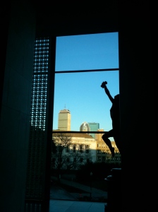
view of boston from new art of americas wing

After selecting the Museum of Fine Arts’ new Art of the America’s wing for a case study, I began researching everything I could find out about the wing. My research turned up a vast amount of information on the wing – its collection, the implementation plan, and its actualization. From the information I uncovered I realized there was much more to the wing than I saw when I visited. Like any large scale project, the fundraising and planning began long before opening day. I realized that any conclusions I might draw from an examination of the wing’s successes and weaknesses would be incomplete without a look into the beginnings of the project.

The roots of the project, and other large changes at the MFA, lie with the current director, Malcolm A. Rogers. When Mr. Rogers came to the MFA in 1994, he employed many strategies to revise the museum’s operations and exhibition programming, such as reorganizing the staff and having the museum hold shows that were appealing to a wider, more diverse audience. The revisions created a new image for a historical institution, helping it annually finish with a budget surplus.

Mr. Rogers also brought significant fundraising skills to his role as Director. The seven year campaign for raising funds for the new MFA wing began in 2001. All the sources I found discussing the (clearly successful) campaign emphasized that the fundraising ended in 2008, before the financial crisis. This certainly cleared up a few things in my mind about the difficulty of raising money in the current environment. The museum was very fortunate that its campaign was completed prior to the economic downturn. The campaign raised money not just for the construction of a brand new wing, but also for the museum’s endowment and operating expenses.

The campaign was able to draw in completely new donors, an incredibly difficult feat, and also was able to draw in people from outside of the Boston area, including some big name New York philanthropists. In the seven year funding campaign, the museum was able to raise an astonishing $504 million, plus an additional $165 million in art donations. The article I found even compared this fundraising feat to other big museums, and commented that it was more successful than attempts by both Los Angeles County Museum of Art and the Art Institute of Chicago.

It seems that Mr. Rogers has a very successful approach. He explained, in a New York Times article by Judith Dobrznski, that the key when approaching donors is to not ask for money for what you need, rather to phrase the request in terms of a grander vision – of what the museum wants to be and could be. Approaching potential donors with the opportunity to be part of making a great institution greater is a very strategic way to address the problem of fundraising. My Development course, which I am currently in the midst of completing, has definitely led me to see that first hand. Every interaction with potential funders should have a strategy lined out – one backed by extensive research and strong reasoning that always attaches to the mission.

It seems that the MFA was highly successful in its fundraising tasks for several reasons. Its Director strongly believes in the museum and its potential and excels at fundraising. He is also willing to use his time to entertain and court potential donors. The museum had a strategy to go beyond the city of Boston, wooing established donors from other cities and targeting people who went to college at one of Boston’s many schools and might have fond memories of the MFA. During its campaign, the museum was also wise enough to secure promises for donations of important collections and artworks – an essential factor that should never be overlooked in a quest for financial support.

The museum’s success in raising funds was a large battle, but not even close to the only task that museum staff had at hand in the creation of the new wing. The next post will examine the planning procedure and how all the the museum addressed building an entirely new wing, reinstalling the new and existing parts of the collection, and using the process to create a new image.


Posted in Uncategorized | Tagged , , , | Leave a comment

museum of fine arts’ new wing: the visit

MFA Entrance

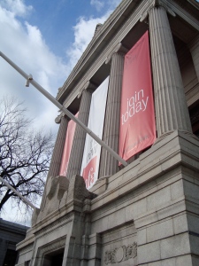
entrance to the museum of fine arts, november 19, 2010. one day until public opening of art of the americas wing.

This final project began in a very un-projecty way: with an escape from new york and the daily grind of cafe hopping and homework to visit some friends in Boston. Being the museum-ophile that I am, I already knew that the Museum of Fine Arts was conveniently opening up a brand new, $504 million addition during my time in Boston. Naturally, a visit to check it out was on the top of my list of to dos.

Since I spend my days and my intellectual energy analyzing and learning about every possible aspect of the exhibition of art in the non-profit realm, I am always on the prowl for untapped sites to unleash my critical eye. At the time of the visit, I was actually knee-deep in researching the issue of exhibiting cultures. The only article I had read about the Museum of Fine Arts’ new Art of the Americas wing was about a) the size of its price tag and b) that it was reevaluating the entire definition of “American” art, and integrating Native American, Canadian, and Latin American art in the new wing’s galleries.

The day of my visit to the MFA was actually the day before the wing opened to the public, and was technically only open to members for a special preview. My boyfriend wisely encouraged me to just see if the museum would let us into the members’ preview on the sole basis of my AAM membership. Amazingly enough, it worked, and we skipped on off to the wing like kids who had managed to get away with something to join all the Bostonian museum-supporters in an advance view of the new half-billion dollar addition.

I went into my exploration with the wing with the intention of examining the new take on the canon of American art. But, from my visit, I ended up spending more thought and time in exploring and participating with all the interactive and technology-laden elements scattered all over the wing. My partner and crime and I spent 5 hours on the four floors of the new wing, checking out the art, playing with the 16 touchscreens scattered over ten of the new galleries.

mark/touchscreen

exploring conservation issues at one of the "behind the scenes" galleries' touchscreens.

The touchscreens were incredibly high-tech, and rather astonishing – some featured educational elements and others were more geared towards creative interactions, such as creating your own porcelain plates from patterns or your own version of a Georgia O’ Keefe. The new wing also had the budget (not to mention the foresight) to create four entire galleries dedicated to a “behind the scenes” approach – to the artwork, the museum, and the creation of the new wing. These galleries had video installations, touchscreens, games, and other educational elements to the degree that I have never before seen in a museum.

After four floors, a pit stop for some cafeteria food, and numerous pictures snapped, we were kicked out for the prep to begin on the opening night gala, which sadly, my AAM membership couldn’t quite get us into. I left the museum with many thoughts about all the new things I had taken in and simply amazed at what the MFA had managed to do with the new wing, in terms of integrating educational and interactive elements seamlessly into its exhibition design.

Only afterwards did I start to really think about just how innovative the wing was, and how it creation and finalized form incorporated nearly every issue I’ve been studying the past semester. In every class, I have read about and discussed the current trend in arts institutions to present artwork in ways to allow for visitor engagement and edification, as well as the new uses of social media and technology to reach new, wider audiences. I decided that the MFA was the perfect case study to apply all these issues. For this case study, I am exploring further – diving in deep to examine the elements that made the wing feel successful to me on my visit. this blog will serve as my platform for both presenting and perhaps more fully organizing and understanding the information that I find about the creation of the new Art of the Americas wing. Perhaps in this new approach to a research term “paper,” I will learn additional things about the ever-evolving, share- focused trends in media and technology, as well.

Posted in Uncategorized | Tagged , , | Leave a comment